
Refreshed Logo for Doughnuts & Deadlifts
Doughnuts & Deadlifts is a lifestyle and apparel brand that believes moderated indulgence isn’t incompatible with health, fitness, and strength.

01
Project Overview
Summary
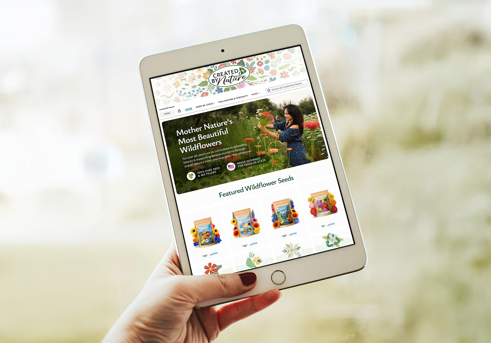
Doughnuts & Deadlifts had been dormant for more than a year, but followers were still hungry for it. Under new ownership, they wanted to come roaring back. To modernize their look, we refreshed their logo with a full suite of variants, designed and built new email flows, and helped craft their announcement post and email. DNDL came back, and tastier than ever.
Services
Challenges
How do you refresh a brand without losing its original essence?
Can a suite of logo variants cover a variety of use-cases while still being consistent?
What makes and engaging and well-performing email flow?
Additional Credits
02
Strategy
The Doughnuts & Deadlifts logo was already well-established and liked by their audience. The first objective was to modernize it, but keep it instantly recognizable. From the new logo, we then extract variations that the brand can use for different contexts.
While they didn’t need an entire rebrand, the new logo and design materials reinforced their voice — playful, colorful, and welcoming.


03
Method
The secondary objectives were to create an announcement post and redesign their email flows with the new look. Like many lifestyle brands, DNDL’s look is heavily dependent on photography, so design only takes center stage when needed.
Our design approach was playful and loose. We sprinkled elements that spilled outside the content, slightly rounded or warped text around images, and rarely stuck to a grid.
With the designs approved, we built the emails directly in Klaviyo. All DNDL’s team had to do was plug them into their flows.
Post-launch, we collaborated again to launch new products with their new look.


About Floresta
Floresta
flow • rest • ah
noun
The Portuguese word for forest. Not just a collection of trees, but a living, biodiverse system. To us, a metaphor for creative growth. A place for discovery, beauty, and wild creativity.

Hi! I’m Daniel — a Swiss army knife for art direction, design, and illustration. Believe it or not, but Floresta is largely a one-person operation.
I've had the pleasure to work on a variety of brands spanning more than a dozen industries and ranged from global conglomerates to local businesses.
I personally handle every project, and you get a direct line to the person executing your vision.
Shortened for brevity. All reviews verified on Trustpilot
“Strategic, collaborative, and deeply committed to quality. I can’t recommend Floresta enough.”
Daniel led the design and development of the latest version of OSARO’s website, and the results speak for themselves.
He brings a rare combination of creative vision and technical precision. Our site is not only polished, but clearly communicates our value and supports our business goals. He’s responsive, reliable, and consistently goes above and beyond.
Director of Creative Services

“Within a week of going live, I received multiple sales and qualified leads.”
I've been working with Floresta for years, and Daniel has quickly become my go to partner for all design work.
He is easy to work with and deeply understands my business goals. He has helped propel my brand's visibility in a very short time and set me apart from the competition.
Founder & CEO

“I questioned the value of hiring a designer in the AI era, but Daniel quickly proved that great designers are still essential.”
Beyond the work, Daniel is simply enjoyable to work with. He brings wit, intelligence, and a strong ability to intuit what we are trying to accomplish.
Even when guidance is minimal or vague, he regularly delivers work that is unique, creative, and right on target.
Head of Marketing

“A communicative collaborator who makes sure our visions are aligned, and delivers.”
Daniel is extremely good at what he does. He's open to ideas while also bringing his tasteful point of view.
He knows the nitty-gritty technical side, and guided me through the whole process with ease. The website that he built for my business is amazing and brings me more clients. I would not have anyone else do it.
Full Out Performance

“Thinks deeply about how creative will produce the best possible results.”
I've worked with Daniel on many, many projects over the last few years. He is a passionate, intelligent, and strategic collaborator who goes way beyond just responding to a brief.
He thinks deeply about how creative will produce the best possible results, and he gives advice freely and fearlessly. If you're looking for a design partner who will bring out the best in your brand, look no farther.
Creative Director
“The creative partner I consistently come back to. Regardless of the project, I know I can trust him to nail it.”
I've worked with Daniel for years at this point in many different capacities. What is unique about Daniel is his versatility. I've worked with him on web design/UX, email design, ad creative, and branding.
He thinks like a business owner, not just a designer. He understands the full picture, from how a user moves through a page to what actually drives conversions in an ad.
Marketing Director
“Daniel understands Amazon as a marketing platform, not just a design project.”
I was looking for someone who not only understood the creative side of Amazon but also the strategy behind driving engagement and conversion. Daniel delivered on both fronts.
His work on our store, listing images, and A+ content doesn’t just look good — it helps tell our story and makes it easier for customers to understand why they should choose our products.
Managing Partner

Frequently Asked Questions
How much do you charge?
Minimum engagements start at roughly $1,700. Website projects start at $5,000 and most end-to-end builds fall between $7,500–$15,000.
Pricing is credit-based — think of it like an arcade. Buy a pack upfront and spend credits on what you actually need. Credits provide design capacity that's actually flexible. No surprise invoices or stopping to renegotiate when something new comes up. Explore our Pricing page for more information.
Want a number for your project? Just reach out!
What's the usual turnaround?
It depends on scope, but most clients are onboarded the same week and start receiving deliverables the following week. Website projects are typically completed in 4-8 weeks from kick-off.
Estimated timelines are always shared upfront before you sign.
What do I need before reaching out?
A rough idea of what you're looking for, a sense of your timeline, and a budget ballpark. The rest we can figure out together.
Who is Floresta a good fit for?
Small to mid-sized companies that need a versatile creative partner; someone who can tackle a wide range of design needs as the business grows.
Think of it less like hiring an agency and more like having a creative director and hands-on designer in one, without the overhead.
What's it like to work with Floresta?
Every project is handled personally by Daniel. No account managers, no handoffs to junior staff. You get a direct line to the senior designer doing the work.
The process is straightforward: we start with a call to nail down scope and vision, move into design, incorporate your feedback, and build. When it's done, we press publish and high five.

Ready for your turn?
Book a call today.
We'd be honored to help your brand thrive.
Book a 30-minute intro call to chat about your brand and see if we're a good fit.
Hate calls? Email us instead.